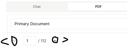
the arrow of next page in PDF viewing is quite counter-inituitive
I suggest the arrow would be left or right instead of up and down. As now the up button ^ is next page, it’s quite not logical and causes me to think twice which one is next page. Therefore, I suggest to modify as below.
Share update with 0 linked conversations as well
Upvoters
Status
In Review
Board
💡 Feature Request
Date
9 months ago
Author

luksum
Subscribe to post
Get notified by email when there are changes.
Upvoters
Status
In Review
Board
💡 Feature Request
Date
9 months ago
Author
luksum
Subscribe to post
Get notified by email when there are changes.